



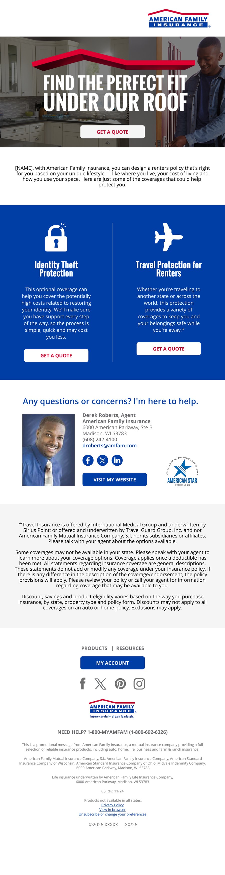
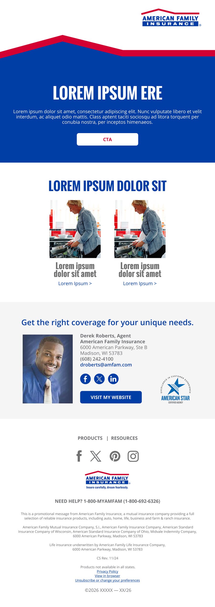
34+ MODULES. ONE VOICE.
Heroes, copy, icons and imagery across white, gray and blue, so a new email starts from approved parts.
BUILD ONE YOURSELF
Pick from the real modules. The right roof drops in between sections, and the system’s guidelines check every combination.
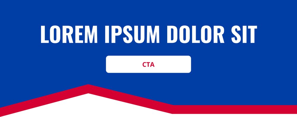
HEROES
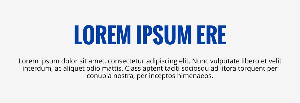
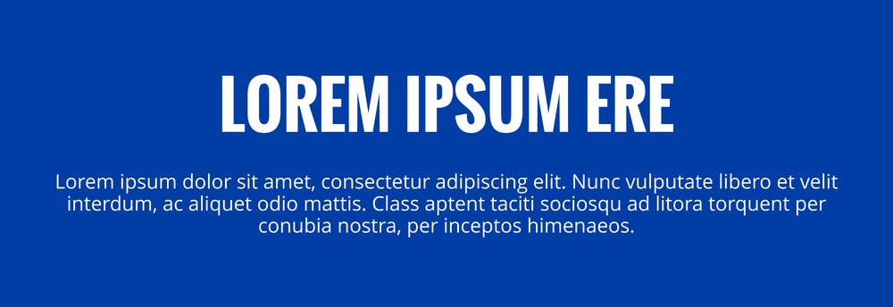
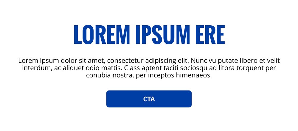
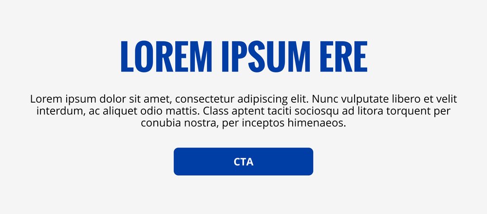
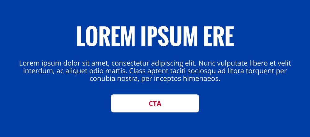
11Text, CTA and roof; split image and text, with or without the roof and CTA; headline and body in white, gray or blue, with or without a CTA.




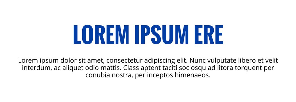
COPY
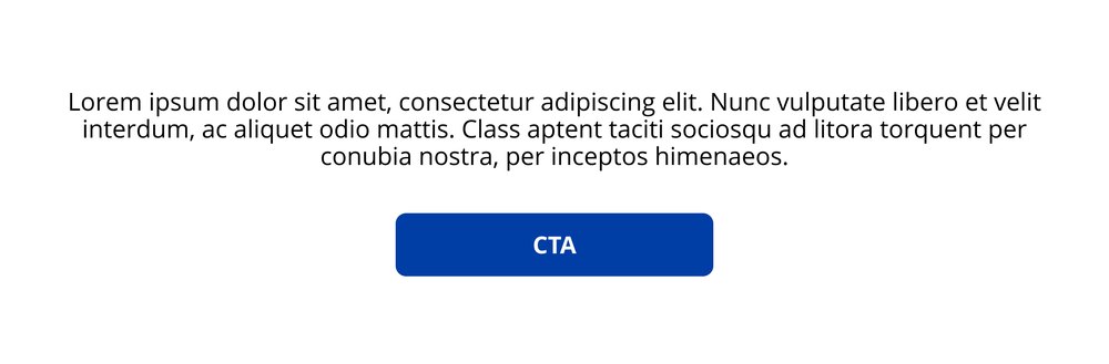
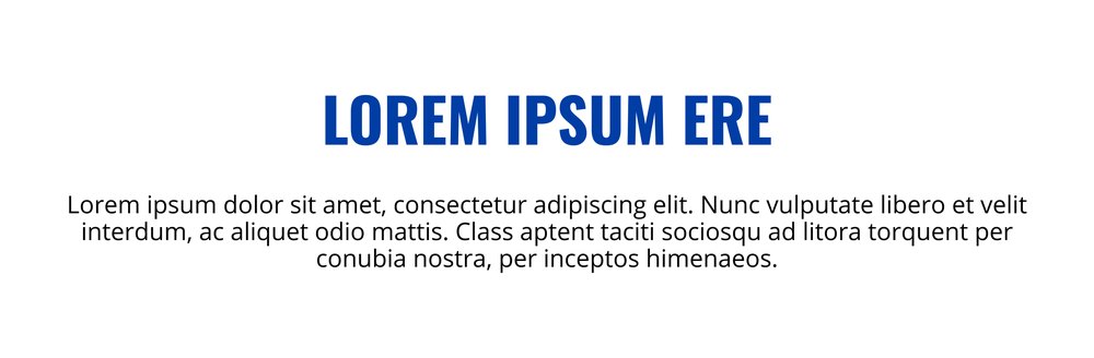
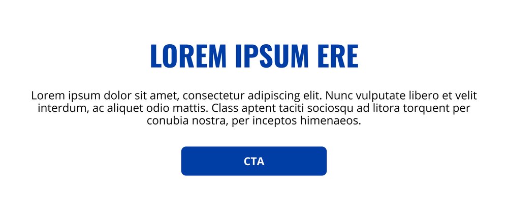
3White body with CTA; white headline and body; white headline, body and CTA.
ICON COLUMNS
9Blue 2-column and gray 3-column layouts, with circle or floating icons and optional CTAs.
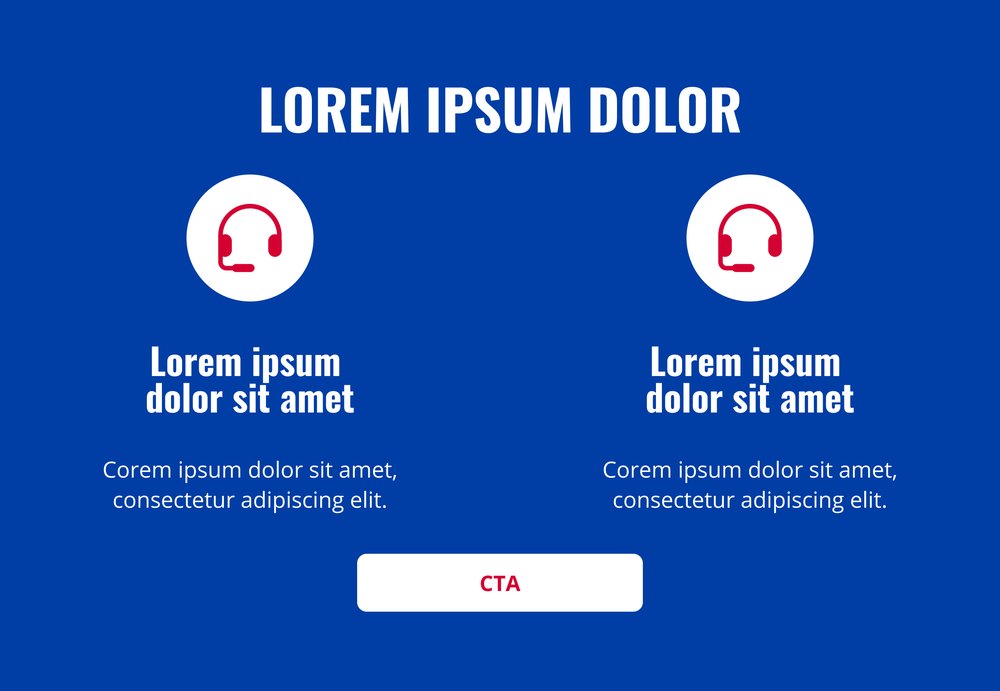
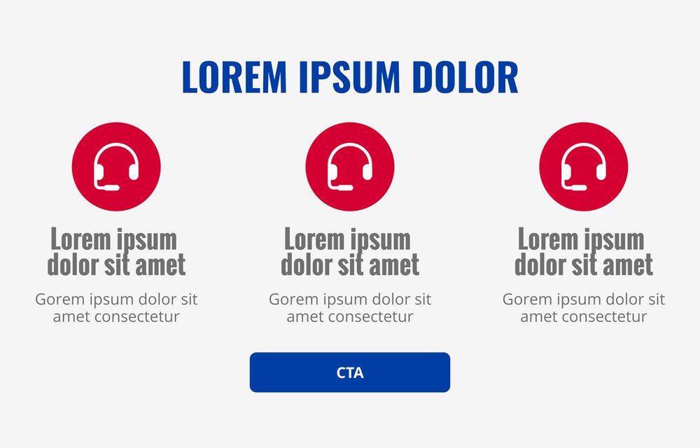
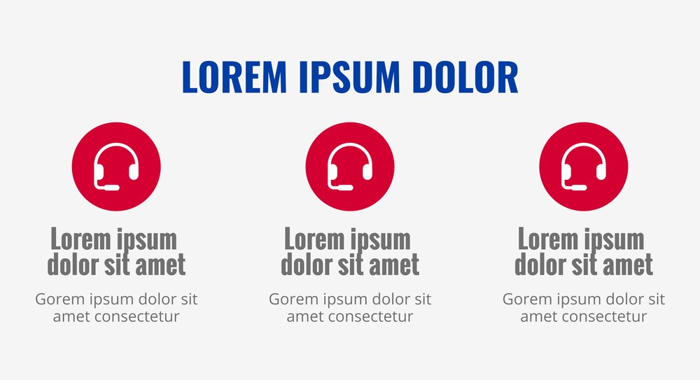
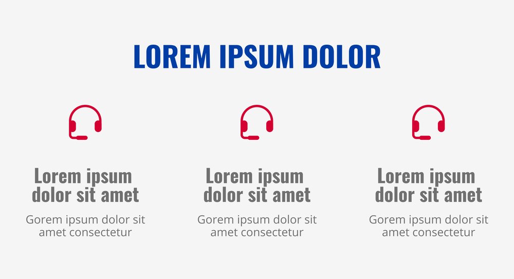
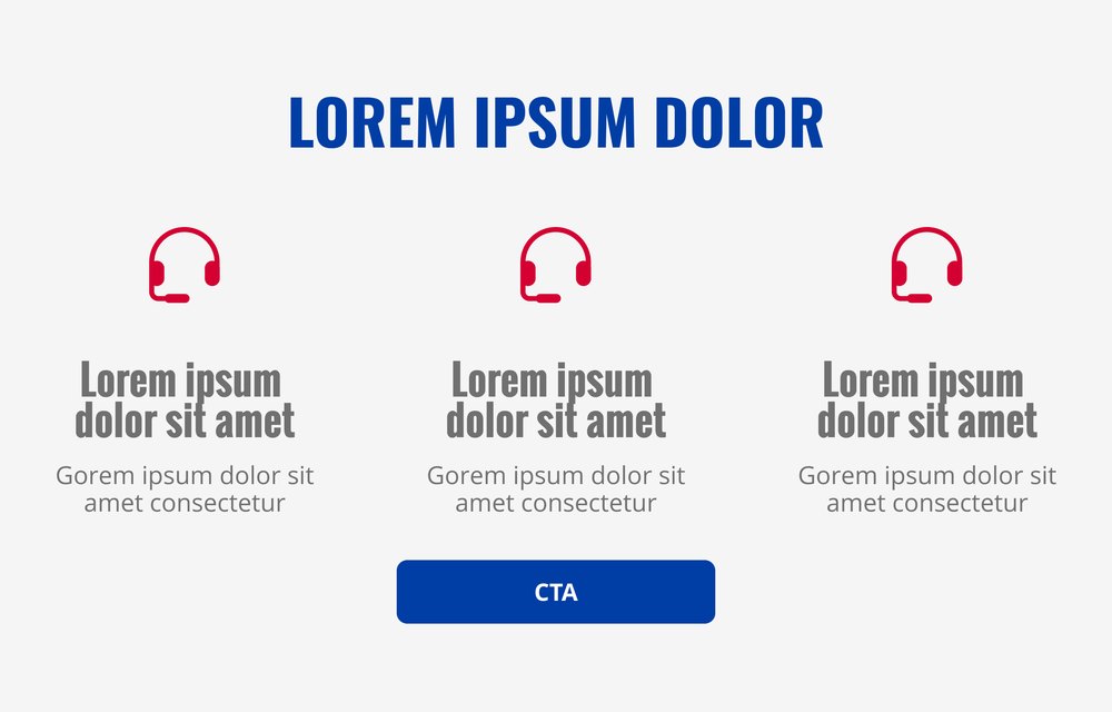
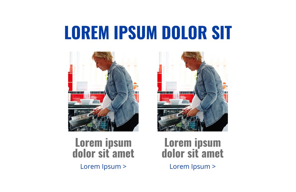
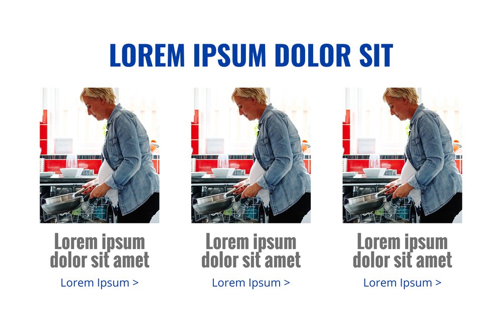
IMAGE COLUMNS
2White 2-column and 3-column image and copy.
ONE ROOF, NINE WAYS
The roofline from the logo became the connective tissue. A divider exists for every move between white, gray and blue.
| From / to | WHITE | GRAY | BLUE |
|---|---|---|---|
| WHITE |  M89 |  M69 |  M68 |
| GRAY |  M67 |  M90 |  M85 |
| BLUE |  M87 |  M86 |  M88 |
FROM KIT TO INBOX
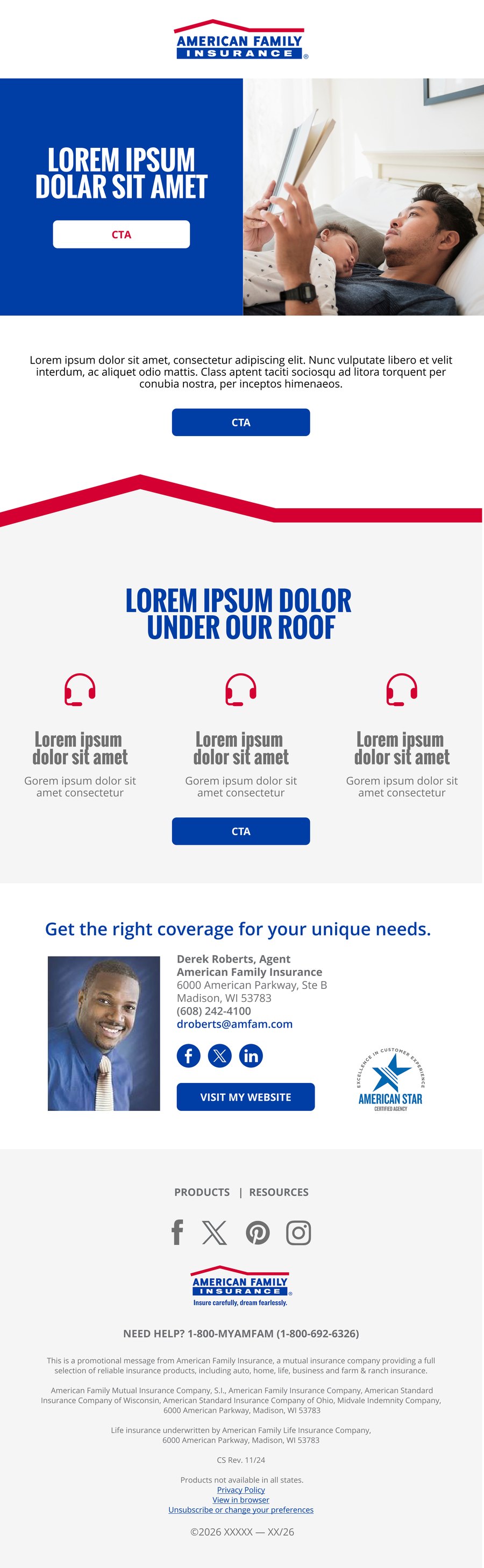
The same parts, assembled into starter templates, then into real auto and renters campaigns.
Starter templates
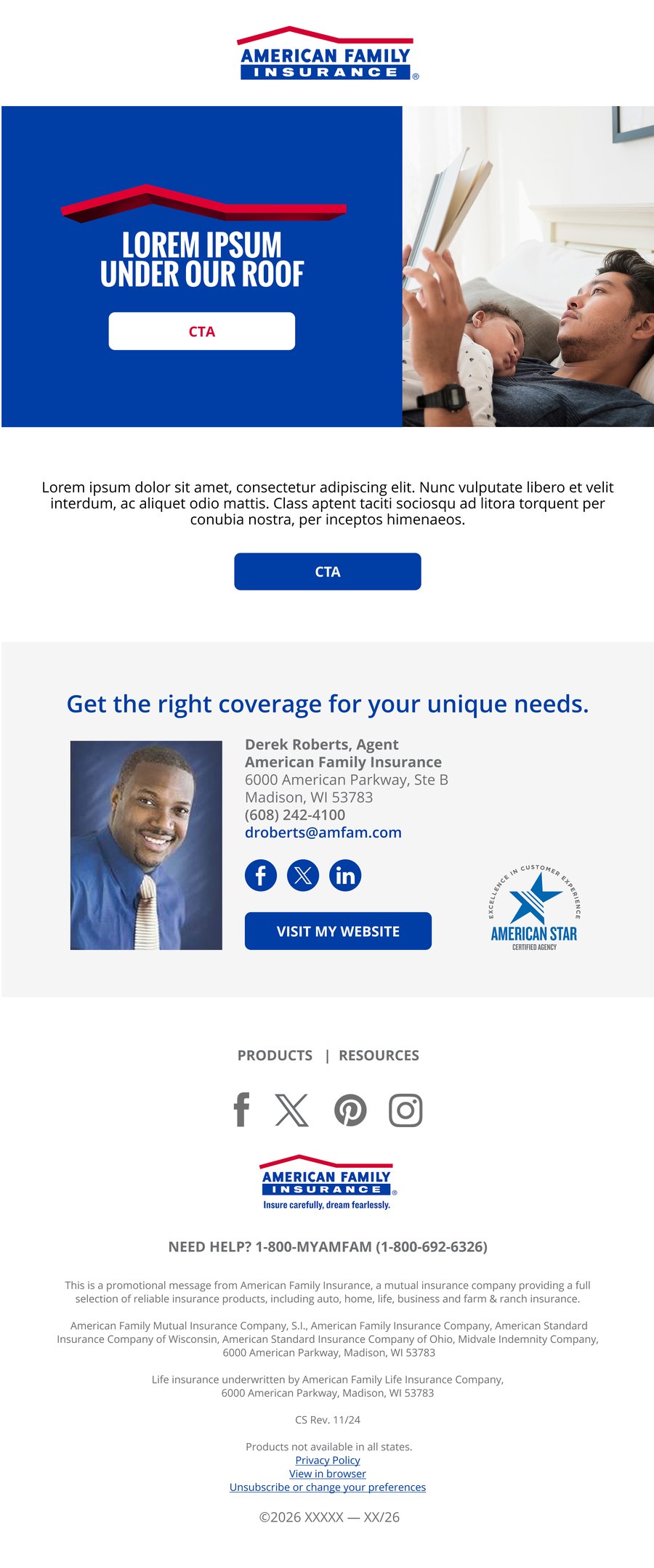
Real campaigns
RULES THAT TRAVEL
AFI’s team would be building these emails themselves, so the guidelines had to do the art directing.
1
Only use a colored background header above a white background or full-bleed hero image.
2
A partner logo should not exceed 286 pixels in width and 104 pixels in height.
3
Only use a right-aligned logo when the hero has the roofline at the top.
AT A GLANCE
34+
modules in this set
9+
roof dividers
3
background colors
3
real campaign emails shown
Next project
AMERICAN DREAMS 2.0